Today I decided to test an online shop that I use on a regular basis, mostly for buying clothes. Their simple policy of free returns and ready-to-reseal packaging make it a low-barrier decision! So let’s have a look.
User Persona
This time the user persona is pretty much me, too. This of course isn’t always the case, but since I’m picking what to review, I get to pick the user persona too.
- Woman over 30, has a family;
- Online savvy;
- Does specific shopping online, but keeps simple shopping offline (groceries);
- Enjoys receiving styling suggestions and getting clothes shopping done quickly (as opposed to browsing through countless stacks of clothes).
User Task
- My task is to find a blue sweater size 38.
Homepage
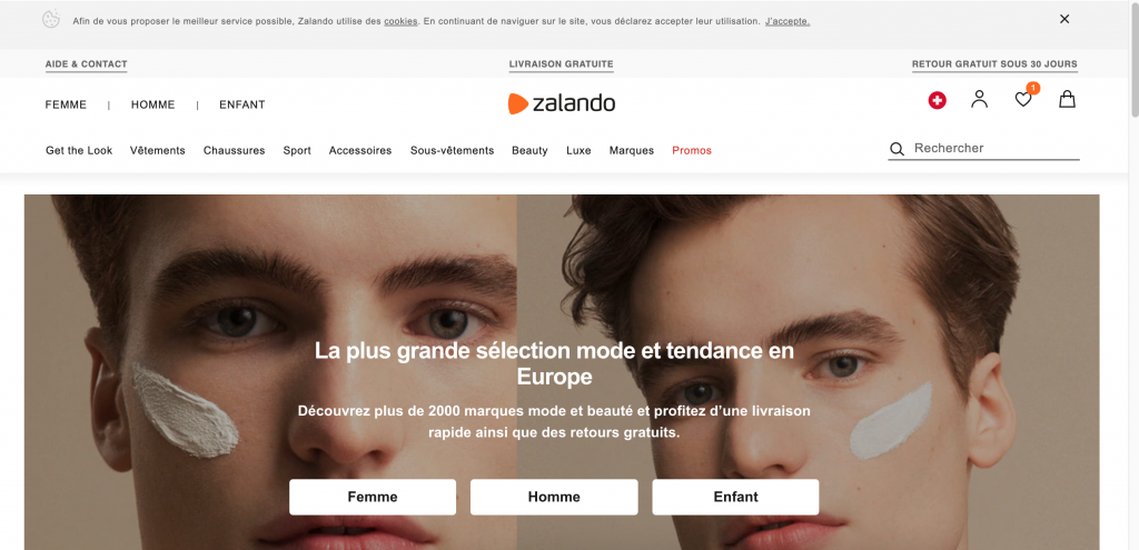
- Pretty good structure of the homepage – the cookies notice is very discrete, the categories are almost the only text links I get to click on, and their main selling point (free shipping and returns) are clearly communicated.
- Language selection tool is where I would expect it – above the fold, next to login and cart.
- The main banner (which is a slideshow) is really big but it’s not distracting me from finding what I want – the images change but the 3 buttons (women, men, kids) are permanent. I really can’t miss the first step!
Category page
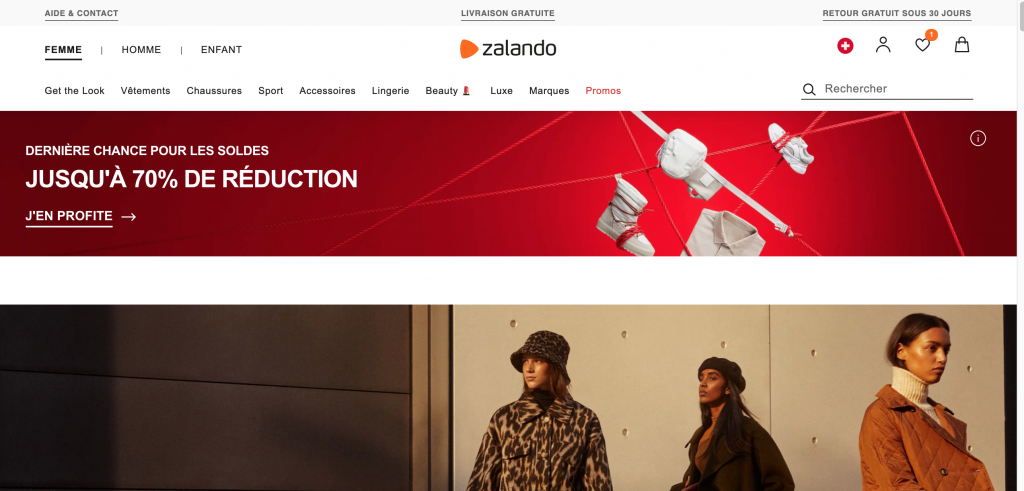
- After clicking on “Women” I land on a category page which could be more focused. I noticed that the top menu changed (Get the look etc.) but since there is another permanent menu above (women, men, kids), I don’t feel lost.
- The banner about -70% makes sense since it’s something that would interest me but it could take less horizontal space and leave space for something more permanent on the left side (for example, a list of subcategories)
- The image under the banner – I don’t know what that is until I scroll down. It looks like a torn out piece of a magazine ad.
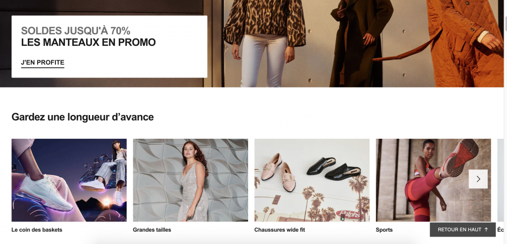
- Scrolling down I realize the image was another ad for -70% but just on coats. Since this ad is very time-specific (during winter and during sales), it makes sense to feature it but again, make it smaller, if not even feature it only on a category of women’s clothing that coats go under. Coats?
- As I scrolled down I was expecting to find sub-categories of women’s clothes that I can click through to get to sweaters but the image slideshow seems to be a specific selection of categories. I’m not sure.
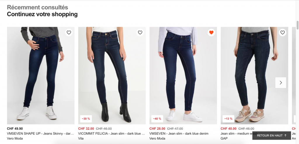
- I keep scrolling but I run into a section of Recently viewed items. I’m pretty sure I’m past the point of finding categories on this page, so I decided to click Back to Top and use the top menu to click through.
Top navigation bar

- The first link says “See all” which makes me think that (a) Why am I not already seeing everything here? and (b) I might not have sweaters listed here so should I bother scanning or just click “See all” first?
- The “Fashionable” category (En Vogue) is slightly misleading. The 4 categories listed under are more like special categories (bigger sizes, petites sizes, maternity etc.). Although I don’t see why these categories should be pulled out. If I was a petite size, I’d search for my size only after I find the items I like. Just like in a shop – you find a sweater you like and then you look through the pile or ask the assistant if they have it in your size. But this testing should be left to users who fit into these categories, to see if that’s how they really shop or not. It’s not my user persona right now.
- There are 4 groups of links but they look equal. The one listing sub-categories (pants, shirts, underwear etc.) should be visually standing out a bit. Categories like Top Brans and New Brands don’t have the same user journey and should be visually secondary.
- Also under the main group (pants, shirts, underwear etc.) there are a few links that seem odd: Exclusive, Eco-responsible fashion and the one I mentioned before, See all.
Sub-category page

- I love the categories menu on the left side! It’s finally there, I can quickly navigate where I want without having to re-trigger the top navigation to unfold and click on the See all (in case I need something else that’s not listed in the top menu).
- The selected category is bolded, well done, and sub-categories are indented. Simple but clear!
Filters / Narrowing down results
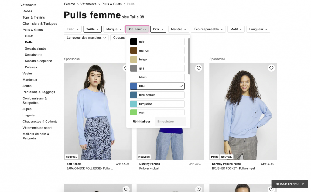
- Since my task is to find a blue sweater of a specific size, I use the filters at the top to narrow down the search results. Due to so many results, I also specify the price range. I think these top filters are REALLY important for Zalando. Just scrolling and sifting through their numerous items would require too much brain power. Too much brain power = postponed or abandoned shopping.
- I wanted to remove one of the filters I applied (price) but didn’t see a quick way to do this (like a grey X next to the filter). Only when I click on the filter itself I see the option to re-start but that’s not the most intuitive.
Product page

- Love the product page! Simple. Prominent photos of the product from different angles. I know some items also have short videos. Simple way to change product color.
- Clear and brief information on the delivery costs and speed. No long sentences or links. Bravo.
- Clicking on the review stars takes me down the page where the reviews are, which is what I expected.
- I’m not entirely convinced about the “Add to cart” button being black. I’ll assume that they’ve done lots of testing to conclude that this B/W contrast makes the button (A) stand out and (B) converts users better than any other color. I personally expected something a little brighter standing out, more actionable. A black button makes me think “Don’t press! Point of no return!”. But maybe that’s just me.
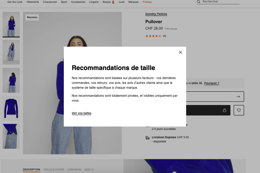
- I like the size suggestion (I am logged in and I have a long purchase history). This is useful for items that have atypical sizes (which I believe are determined by users reporting products being too big / small). This reduces returns, dissatisfaction and shipping costs! Good idea, Zalando. I also like that the link “Why” (next to the size that’s recommended for me) is a pop-up and not a new page. And that I can close that pop-up by clicking anywhere on the page (not necessarily on the X). Love it.

- Let’s talk about choosing the sizes. This is a slide-in window with options for this particular item. I like it because it has “recommended size” gently tagged on the side, notice about out of stock sizes and low stock. Clean and clear. I would be curious to know how many users get guidance by the column “Brand Size” though.
Add to cart

- I clicked the black button which then briefly turned green when the item was successfully added to cart. I also got roll-down notice from the top cart icon showing me the cart contents and total, with a link to the cart page. Worth testing if that orange link should actually be “Checkout”, to encourage users to complete the purchase. I don’t think it would distract them from shopping for something else, since the main product page is still open and prominent, if users had other things in mind. But for those that just want one thing, they’d have this shortcut to finish their shopping.
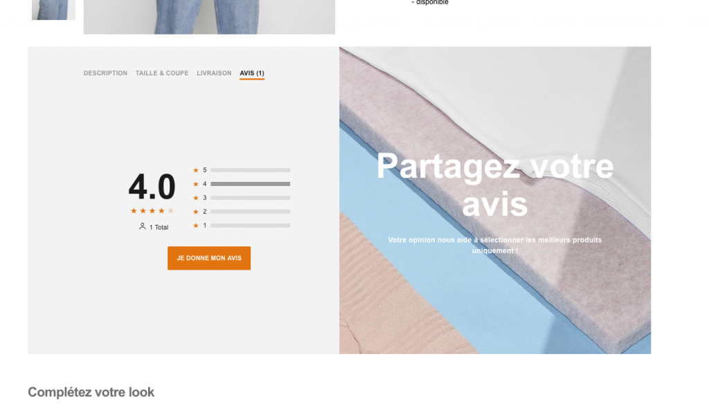
- Scrolling a little further down the product page, there’s the comments section. This is something that Zalando should work on more. A lot of items don’t have any comments or simple reviews. They encourage it by saying that comments will help them choose the best products, but that sounds like I’d be helping Zalando. What’s in it for the user though? Can you offer a 10% discount on the next purchase if I leave 3 reviews?
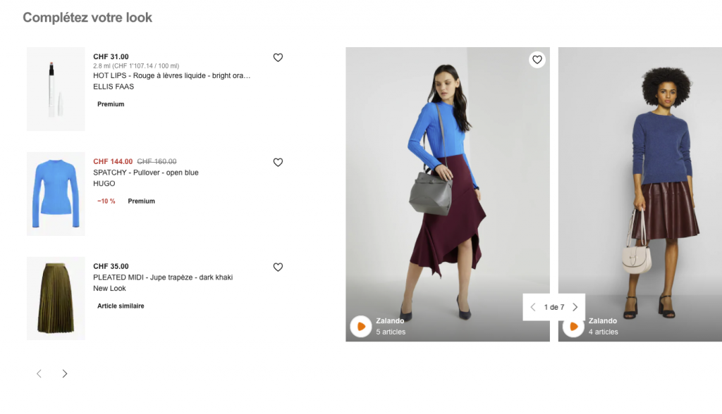
- Scrolling further down, I get recommendations for a full look. As someone who appreciates suggestions, I like this. I’ve yet to purchase something based off of this but one day I might!
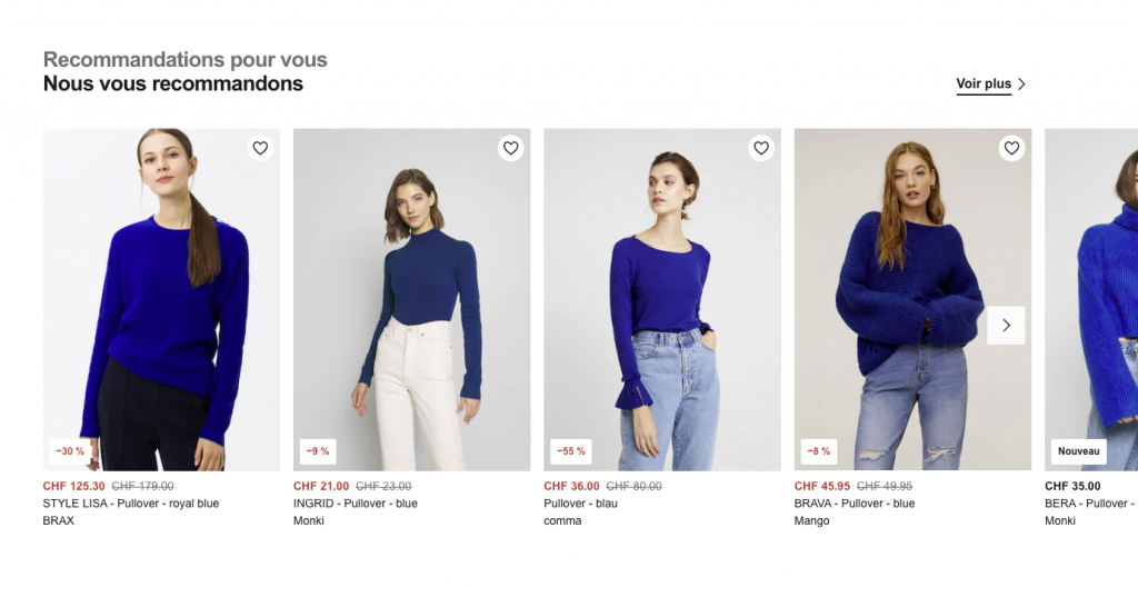
- Even further down the product page, I get suggestions for similar items. I would move that up the page. I know I’ve used this more than once in the past. For some reason, this function of selecting items that are similar to the one I’m looking at, works better than the simple search with filters on the search results. Definitely a keeper.
- I would put the “See more” link below the images, not above. My eyes goes left to right, then for more I always expect something at the bottom of whatever has been clipped.

- Still on the same page, a little lower, I start getting related suggestions. I’m not sure how looking for a blue sweater would make me want to buy a blue skirt but it is rather refreshing! It feels like a “You seem to like this particular blue, so why don’t you look at these blue skirts and give it a try” kind of feature.
- I’d open the product links of these skirts in new tabs, so that as a user I don’t lose my shopping thread.

- This is the last section of the product page. It’s pointed out that these items are paid promotions, so … whatever. I skipped over them. The “sponsored listings” always make me doubt that these have been selected carefully enough to please me. Meh.

- Just before the footer, there’s a list of brans and categories. I’m not sure if these are based on the product I’m considering buying or if they are complete. It looks like SEO work, not really user-centered.
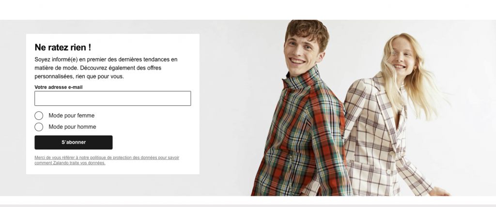
- Email sign-up box at the bottom of the page. Looks very typical. At some point Zalando was offering a 10% discount code upon sign-up, which is a good incentive (yes, you lose those that signed up just for that, but others stay).

- I finally reached the bottom of the page! Product pages are usually a lot more focused (shorter) but it doesn’t mean they convert better. So I would be curious to see the conversion rates on different product page types.
- Footer is rather well organized, but may be worth grouping some links more – put the links in the bottom dark grey area above into the light grey area (either by grouping them into existing links or creating a link column named “Legal”). Blog links could go somewhere else.
Cart page
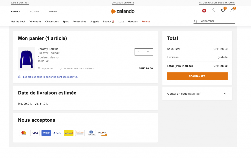
- I like the cart page! Simple, clean and focused. I see everything I need to know at a glance – the items, the total, the estimated delivery date and payment methods accepted.
- There’s also an easy way to remove items from the cart – in light grey, so really secondary to the action of purchasing but not impossible.
Checkout

- First step to checkout – log in or registration. Love the outlined steps above and the top bar (with not navigation) and a notice that my payment is processed securely.
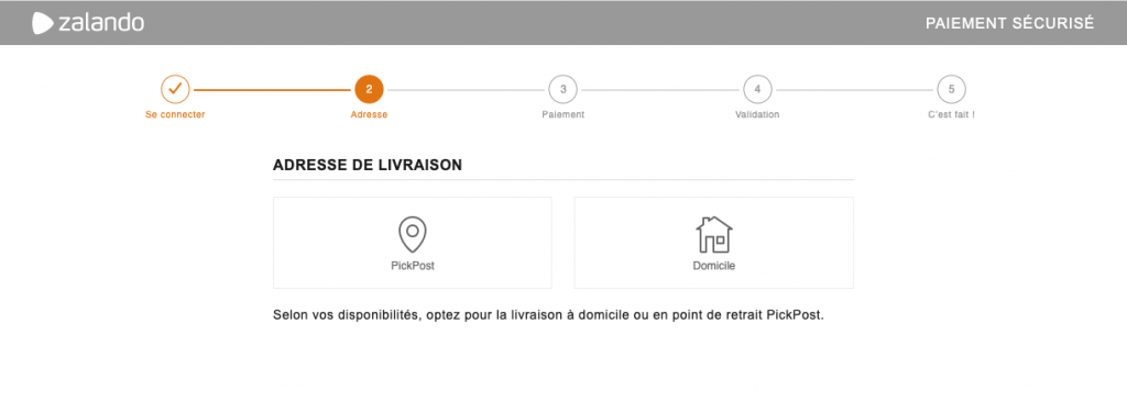
Second step – choosing delivery or pick-up point. I don’t suppose this could be merged with another step? If not, this is still a light page – quick selection and I’m on step 3, so no biggie. When I clicked delivery, I confirmed my address (that was already populated after my login).

- Payment step. I clicked on the bottom “Return to shop” link which I really appreciate! I know shops want to push users to finish the purchase by removing all distractions but if I need or want to return to the shop, I’ll only be frustrated that I can’t, have to open a new tab, re-type in the address and somehow merge my two separate experiences into one in the end (if I added a product from the new tab, I need to refresh my checkout info). There’s a way to make it possible without encouraging abandoning the checkout and I think Zalando does a great job at it!
- Another great point is that when I was back on their homepage, and clicked “Checkout” again, I landed directly on the step I was last on. No need to re-confirm my information, delivery and address. Well done.
Conclusion
All in all, I think Zalando is doing a LOT of things right. Many details have been ironed out and really thought out, so it’s one of my favorite shopping experiences.
I think they could work on personalizing pages a little more and testing options (if they haven’t already, which is quite possible).
Keep in mind, this was a fraction of a usability testing, with one persona and one task, so the picture is not complete. But it does give a good sense of the user experience and it’s a pretty good one!
